반응형
친구 여러분, 오늘은 이 블로그에서 HTML 및 CSS를 사용하여 애니메이션 제품 미리보기 카드 디자인을 만드는 방법을 배우게 될 것입니다. 이전 블로그에서 HTML과 CSS를 사용하여 멋진 프로필 카드를 만드는 방법을 살펴보았습니다. 이전에 많은 카드 디자인을 공유했지만 이번 프로젝트에서 고급 CSS의 클립 경로 속성을 사용했기 때문에 이 디자인과는 다릅니다. 이 카드 디자인을 확인하는 것을 잊지 마세요.
제품 미리보기 카드는 거의 모든 전자상거래 웹 사이트에서 제품 미리보기를 표시하는 요소입니다.
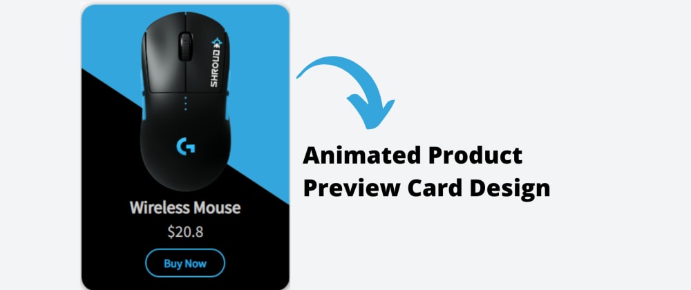
이 디자인 [애니메이션 제품 미리보기 카드 디자인]에는 위의 이미지에서 볼 수 있듯이 두 가지 배경색을 가진 카드가 있습니다. 이 카드에는 무선 마우스라는 제품 이미지가 있고 제품에 대한 세부 정보가 있습니다.
우리가 이미지 위에 마우스를 올려놓으면 이미지의 배경이 디자인으로 바뀌고 디테일이 위로 올라가며 부드러운 전환과 함께 디테일 대신 버튼이 나타납니다. 무슨 말인지 모르겠으면 소스 코드를 확인하고 미리 볼 수도 있습니다.
여기서 이 프로젝트의 미리 보기를 사용할 수 있습니다.
애니메이션 제품 미리보기 카드 설계 [소스 코드]
HTML 코드
<!-- ------------------ Created By InCoder ------------------ -->
<!DOCTYPE html>
  <html lang="en">
    <head>
        <meta charset="UTF-8">
              <meta http-equiv="X-UA-Compatible" content="IE=edge">
                    <meta name="viewport" content="width=device-width, initial-scale=1.0">
                          <title>Animated Product Preview Card - InCoder</title>
    <link rel="stylesheet" href="main.css">
      </head>
<body>
          <div class="inContainer">
                    <div class="productImg">
                                  <img src="images/mouse.png" alt="">
                                            </div>
        <div class="details">
                      <h3 class="title">Wireless Mouse</h3>
            <p class="price">$20.8</p>
        </div>
        <button class="buyNow">Buy Now</button>
    </div>
</body>
</html>
CSS 코드
/* ------------------ Created By InCoder ------------------ */

@import url('https://fonts.googleapis.com/css2?family=Source+Sans+Pro&display=swap');

*{
      margin: 0;
      padding: 0;
      box-sizing: border-box;
      font-family: 'Source Sans Pro', sans-serif;
}

body{
      height: 100vh;
      display: flex;
      align-items: center;
      background: #d5d5d524;
      justify-content: center;
}

.inContainer {
      display: flex;
      overflow: hidden;
      max-width: 18rem;
      text-align: center;
      position: relative;
      max-height: 24.8rem;
      align-items: center;
      border-radius: 1.2rem;
      flex-direction: column;
      justify-content: center;
      transition: clip-path .8s;
      box-shadow: 1px 2px 10px #888;
}

.inContainer::before{
      content: '';
      top: 0%;
          left: 0%;
              height: 100%;
                  width: 100%;
                      z-index: -1;
      position: absolute;
      background: #33a7dd;
      transition: clip-path .8s;
      clip-path: polygon(0 0, 100% 0, 100% 35%, 0 70%);
}

.inContainer::after{
      content: '';
      top: 0%;
          left: 0%;
              height: 100%;
                  width: 100%;
                      z-index: -1;
      position: absolute;
      background: #000;
      transition: clip-path .8s;
      clip-path: polygon(0 100%, 100% 100%, 100% 35%, 0 70%);
}

.inContainer:hover::after{
      clip-path: polygon(0 100%, 100% 100%, 100% 70%, 0 22%);
}

.inContainer:hover::before{
      clip-path: polygon(0 0, 100% 0, 100% 70%, 0 22%);
}

.inContainer .productImg img{
      z-index: 2;
      max-width: 25rem;
      transform: translateY(12px);
}

.inContainer .details .title{
      color: #cecece;
      font-size: 1.5rem;
}

.inContainer .details .price{
      margin-top: 4px;
      color: #cecece;
      font-size: 1.4rem;
      margin-bottom: 10px;
}

.inContainer .details{
      transition: transform .8s;
      transform: translateY(2rem);
}

.inContainer:hover .details{
      transform: translateY(-1rem);
}

.inContainer:hover .buyNow{
      opacity: 1;
      pointer-events: all;
      transform: translateY(-1rem);
}

.inContainer .buyNow{
      cursor: pointer;
      font-size: 16px;
      font-weight: 600;
      color: #33a7dd;
      border-radius: 50px;
      pointer-events: none;
      padding: .5rem 1.5rem;
      margin-bottom: 1.6rem;
      transition: transform .8s;
      border: 2px solid #33a7dd;
      transform: translateY(6rem);
      background-color: transparent;
}

.inContainer .buyNow:hover{
      color: #fff;
      transition: background-color .3s, color .3s;
      background-color: #33a7dd;
}'css' 카테고리의 다른 글
| 인도의 마젠토 2 인증 개발자 | 마젠토 (0) | 2022.02.16 |
|---|---|
| HTML 및 CSS를 사용한 Response Product Preview 카드 (0) | 2022.02.16 |
| 스크롤 기능이 활성화되는 동안 스크롤 막대 보기 숨기기 - CSS (0) | 2022.02.16 |
| CSS를 사용하여 스크롤 막대를 스타일 지정하는 방법 (0) | 2022.02.16 |
| HTML을 사용하여 이미지에 텍스트 오버레이 (0) | 2022.02.16 |


댓글