
안녕하세요, 개발자 여러분, 새해 복 많이 받으세요! 그래서 오랜 휴식 후에.
또 다른 반응?
예, 응답성 랜딩 페이지 작성에 관한 다양한 블로그를 만들어 보았으며, 링크는 http 아래에 있습니다.
전체 블로그 게시물을 읽는 대신 코드 튜토리얼을 시청하는 데 관심이 있다면 아래의 비디오를 시청하십시오.
이 게시물의 소스 코드는 Github에서 모든 이미지와 함께 사용 가능하므로 소스 코드를 얻으려면 아래 링크를 방문하십시오.
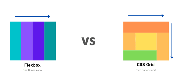
다시 한 번 코딩 블로그 포스트에서, 우리는 가장 근본적인 두 가지를 다루고 있다.
당신은 둘 사이의 주요 차이점이 무엇인지 알고 있었나요?
만약 당신이 이미 알고 있다면, 만약 당신이 절대적인 천재라면, 걱정마세요, 아래에 주어진 이미지는 CSS Flexbox VS CSS Grid가 도대체 무엇인지 간단히 묘사되어 있습니다.
, 이제 그만! 이제 우리가 여기 있는 코딩 파트로 들어가자!!!
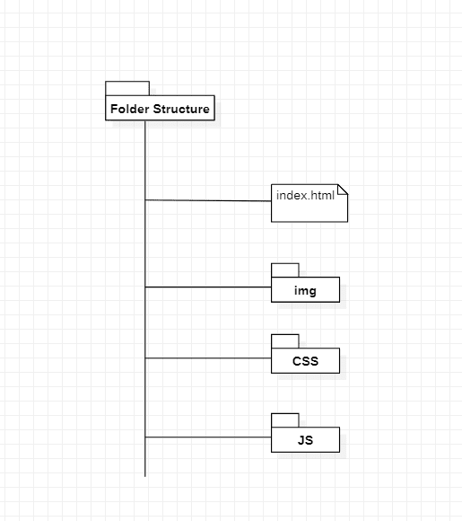
먼저 프로젝트 폴더 구조부터
일반적으로 를 포함한 3개의 외부 라이브러리를 사용했습니다.
- Boxicons - 오픈 소스 아이콘 라이브러리입니다.
- Google 글꼴 - 글꼴 내장 라이브러리입니다.
- GreenSock의 GSAP - 최신 웹용 프로페셔널급 JavaScript 애니메이션을 만듭니다.
그래서 위의 프로젝트 폴더 구조에서 index.html, style.css, script.js가 필요합니다.
이 파일들을 만든 후에 당신이 가장 좋아하는 코드 편집기로 들어가보죠.
우선, 우리는 루트, HTML의 재설정을 포함한 우리의 CSS 파일의 몇 가지 기본적인 변경을 볼 것이다.
Style.css
/* ===== GOOGLE FONTS : www.fonts.google.com ======  */
@import url("https://fonts.googleapis.com/css2?family=Poppins:wght@300;400;500;600&family=Rubik:wght@300;400;500&display=swap");
/* ==== ROOT ==== */
* {
   margin: 0;
   padding: 0;
   box-sizing: border-box;
   font-family: "Poppins", sans-serif;
}
/* ==== CSS VARIABLES ==== */
:root {
   --logo-text-color: #23241f;
   --lg-text-color: #000000;
   --sm-text-color: #828282;
   --md-light-text: #353534;
   --light-text: #959188;
   --text-color: #80b801;
   --light-border: #d9eab3;
   --gradient-start: #f0fff1;
   --gradient-middle: #fefefa;
   --gradient-end: #fff;
}
/* ==== HTML RESET ==== */
html,
  body {
     scroll-behavior: smooth;
  }
body {
   height: 100vh;
   width: 100%;
    background: linear-gradient(
        124deg,
        var(--gradient-start) 0%,
        var(--gradient-middle) 50%,
            var(--gradient-end) 100%
               );
}
a {
   text-decoration: none;
}
button {
   border: none;
   outline: none;
   cursor: pointer;
}
ul li {
   list-style-type: none;
}

/* ==== CONTAINER ==== */
.container {
      max-width: 1028px;
      margin: 0 auto;
      padding: 0rem;
}
.grid {
      display: grid;
}

@media screen and (min-width: 64em) {
      .container {
                width: 100%;
                        padding: 1rem;
      }
}
좋습니다! 보시다시피 Google 글꼴을 프로젝트에 가져왔습니다. 즉, 글꼴 가중치에 따라 Poppins와 Rubik이 포함됩니다.
우리는 HTML을 추가할 골격을 추가하기 위해 더 나아가고 있습니다.
기본 마크업을 추가하기 위해 index.html 파일에 들어오세요.
인덱스.dex.disp
<!DOCTYPE html>
<html lang="en">
<head>
<meta charset="UTF-8" />
<meta http-equiv="X-UA-Compatible" content="IE=edge" />
<meta name="viewport" content="width=device-width, initial-scale=1.0" />
<title>Medme Landing Page - Responsive Landing Page</title>
<!-- ======= STYLE ====== -->
<link rel="stylesheet" href="./CSS/style.css" />
<!-- ======= BOXICONS CDN ====== -->
<link
href="https://unpkg.com/boxicons@2.1.1/css/boxicons.min.css"
rel="stylesheet"
/>
<!-- ======= GSAP CDN ====== -->
<script src="https://cdnjs.cloudflare.com/ajax/libs/gsap/3.8.0/gsap.min.js"></script>
</head>
<body>
<!-- ======= Script.js ====== -->
<script src="./JS/script.js"></script>
</body>
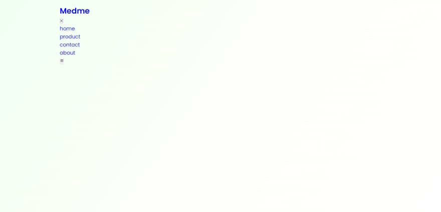
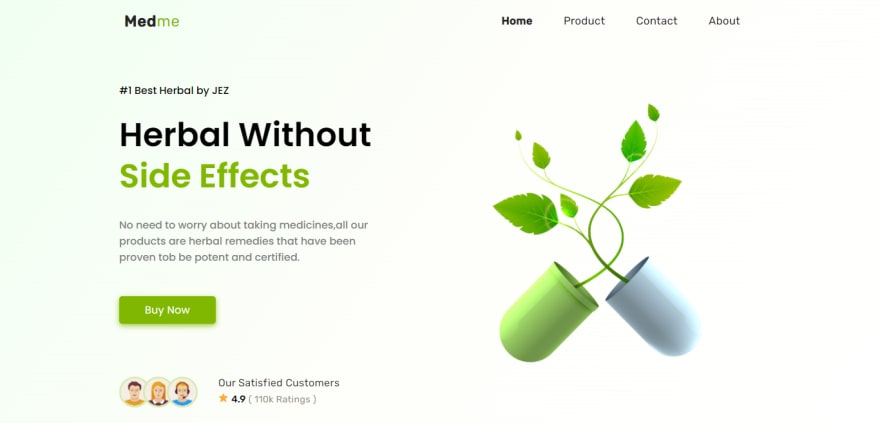
</html>자, 여기 우리의 백지 결과 =>

자! 이제 첫 번째 구성 요소를 만들어 보겠습니다. 가장 중요한 구성 요소는 내비게이션 바 또는 Navbar입니다.
인덱스.dex.disp
<header class="header container">
<nav class="navbar">
<div class="logo">
<h2 class="logo-name">
<a href="#">Med<span>me</span> </a>
</h2>
</div>
<div class="nav_menu">
<div class="close-nav">
<button class="close_btn">✕</button>
</div>
<ul class="nav-link-list">
<li class="nav-link-list-item">
<a class="nav-link active" href="#">home</a>
</li>
<li class="nav-link-list-item">
<a class="nav-link" href="#">product</a>
</li>
<li class="nav-link-list-item">
<a class="nav-link" href="#">contact</a>
</li>
<li class="nav-link-list-item">
<a class="nav-link" href="#">about</a>
</li>
</ul>
</div>
<button class="toggle_btn">
<i class="bx bx-menu"></i>
</button>
</nav>
</header>결과 =>
style.css 파일에서 스타일 추가
Style.css
/* ==== ROOT RESET ==== */
/* ==== HTML RESET ==== */
/* ==== CSS VARIABLES ==== */
/* ==== CONTAINER ==== */
/* ==== HEADER ==== */
.header {
      width: 100%;
          height: 4rem;
      margin-bottom: 3rem;
}
.navbar {
      width: 100%;
          height: 100%;
              padding: 0 0.5rem;
      display: flex;
      align-items: center;
      justify-content: space-between;
}
.logo {
      min-width: 100px;
}
.logo-name a {
      font-family: "Rubik", sans-serif;
      letter-spacing: 0.7px;
      font-size: 1.5rem;
      color: var(--logo-text-color);
}
.logo-name a span {
      font-family: "Rubik", sans-serif;
      color: var(--text-color);
      font-weight: 400;
}

.close-nav {
      display: none;
}
.close-nav {
      display: none;
}

.close_btn {
      background-color: #f3f4f6;
      font-size: 1rem;
      width: 2.5rem;
      height: 2.5rem;
      border-radius: 50%;
          font-weight: 600;
}
.close_btn:hover {
      background-color: #ffffff;
}

.nav-link-list {
      display: flex;
}
.nav-link-list-item {
      margin: 0 1.5rem;
}
.nav-link-list-item .nav-link {
      font-family: "Rubik", sans-serif;
      font-size: 1.05rem;
      letter-spacing: 0.3px;
      text-transform: capitalize;
      color: var(--logo-text-color);
}
.nav-link.active {
      font-weight: 600;
}
.nav-link:hover {
      color: var(--text-color);
}

.toggle_btn {
      background-color: transparent;
      display: none;
}
.toggle_btn i {
      font-size: 1.5rem;
}

.show {
      right: 0 !important;
}

.no-scroll {
      overflow-y: hidden;
}
결과 =>
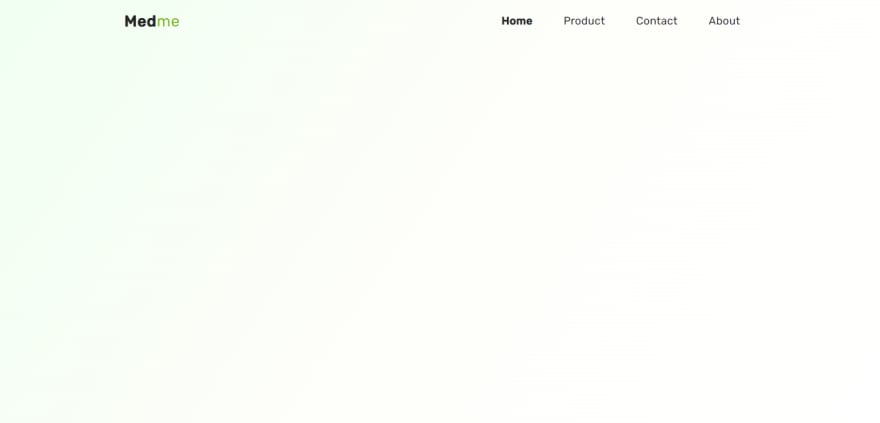
그래서 지금까지 탐색 막대를 만들고 탐색하기 쉬운 스타일을 추가했습니다

기다려봐, 아직 안끝났어요!
영웅 섹션
예, 영웅 섹션 에서는 귀사를 한눈에 볼 수 있는 정보를 제공합니다.
index.html 파일에 영웅 섹션에 마크업을 추가합시다.
인덱스.dex.disp
<!-- ====== HEADER ====== -->
<!-- ====== HERO SECTION ====== -->
<div class="container">
     <section class="grid grid-cols-2">
             <!-- ===== GRID-ITEM-1 ===== -->
             <div class="grid-item-1">
                        <div class="flex-item-1">
                                      <p class="product-intro">#1 Best Herbal by JEZ</p>
            <h1 class="product-tagline">
                             herbal without <span>side effects</span>
            </h1>
            <p class="product-desc">
                             No need to worry about taking medicines,all our products are
                                            herbal remedies that have been proven tob be potent and certified.
                                                        </p>
            <a href="#" class="cta-btn">buy now</a>
         </div>
         <div class="flex-item-2">
                       <ul class="customer-list">
                                        <li class="customer-list-item">
                                                            <img class="customer-img" src="./img/01.png" alt="cusomtor-1" />
                                                                             </li>
               <li class="customer-list-item">
                                   <img class="customer-img" src="./img/02.png" alt="cusomtor-2" />
                                                    </li>
               <li class="customer-list-item">
                                   <img class="customer-img" src="./img/03.png" alt="cusomtor-3" />
                                                    </li>
            </ul>
            <div class="customer-related-desc">
                             <p>our satisfied customers</p>
               <span class="rating-star">
                                <i class="bx bxs-star"></i>
               </span>
               <span class="rating-count">4.9</span>
               <span class="ratings">( 110k Ratings )</span>
            </div>
         </div>
      </div>
      <!-- ===== GRID-ITEM-2 ===== -->
      <div class="grid-item-2">
                 <div class="plant-img">
                               <img src="./img/plant-img.png" alt="plant-img" />
                                          </div>
      </div>
   </section>
</div>
결과 =>

뭔가 모양이 잡히는 것 같아요. 그래, 거기에 스타일을 더해보자.
Style.css
 .grid-cols-2 {
       grid-template-columns: repeat(2, 1fr);
 }

.grid-item-1 {
      display: flex;
      flex-direction: column;
      justify-content: space-between;
      height: 100%;
}

.flex-item-1 {
      width: 80%;
}
.product-intro {
      font-size: 1rem;
      color: var(--lg-text-color);
      font-weight: 500;
}
.product-tagline {
      font-size: 3.2rem;
      color: var(--lg-text-color);
      line-height: 1.25;
      text-transform: capitalize;
      margin-top: 1.5rem;
}
.product-tagline span {
      color: var(--text-color);
}

.product-desc {
      color: var(--sm-text-color);
      font-weight: 500;
      margin-top: 2rem;
      font-size: 1rem;
}

.cta-btn:active,
  .cta-btn:visited {
        color: var(--gradient-end);
  }
.cta-btn {
      display: block;
      width: 150px;
      height: 43px;
      background-color: var(--text-color);
      font-size: 1rem;
      letter-spacing: 0.3px;
      display: flex;
      align-items: center;
      justify-content: center;
      text-transform: capitalize;
      border-radius: 5px;
      margin-top: 3rem;
      transition: 0.5s;
      color: var(--gradient-end);
      box-shadow: 0px 3px 10px 0px rgba(128, 184, 1, 0.75);
}
.cta-btn:hover {
      background-color: #73a601;
}
.cta-btn:active {
      transform: scale(0.85);
}

.flex-item-2 {
      display: flex;
      gap: 2rem;
      padding-left: 0.7rem;
}

.customer-list {
      display: flex;
}
.customer-list-item {
      width: 3rem;
      height: 3rem;
}
.customer-list-item .customer-img {
      width: 100%;
          height: 100%;
              border-radius: 50%;
                  object-fit: cover;
}
.customer-img {
      border: 3px solid var(--light-border);
}
.customer-list-item {
      margin-left: -0.7rem;
}

.customer-related-desc p {
      font-size: 1rem;
      font-weight: 400;
      text-transform: capitalize;
      letter-spacing: 0.3px;
      font-family: "Rubik", sans-serif;
      color: var(--md-light-text);
      margin-bottom: 0.2rem;
}
.rating-star {
      color: #ffac37;
}
.rating-count {
      color: var(--lg-text-color);
      font-weight: 500;
      font-size: 0.95rem;
      font-family: "Rubik", sans-serif;
}
.ratings {
      color: var(--light-text);
      letter-spacing: 0.3px;
      font-size: 0.9rem;
      font-family: "Rubik", sans-serif;
      font-weight: 400;
}

.plant-img {
      width: 100%;
          height: 100%;
}
.plant-img img {
      width: 100%;
          height: 100%;
} 
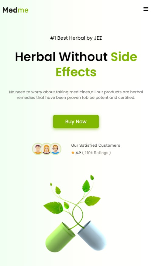
이제 반응성 미디어 쿼리를 추가하여 모바일이나 태블릿과 같은 작은 화면 장치에서 반응성을 높입니다.
Style.css
/* ===== HEADER ===== */
/* ===== HERO  ===== */
/* ===== RESPONSIVE MEDIA QUERIES  ===== */
@media screen and (max-width: 991px) {
  body {
    background: linear-gradient(
      90deg,
      var(--gradient-start) 0%,
      var(--gradient-middle) 50%,
        var(--gradient-end) 100%
          );
  }
  .close-nav {
    width: 100%;
    display: flex;
    justify-content: flex-end;
  }
  .nav_menu {
    position: fixed;
    top: 0;
    right: -100%;
    height: 100vh;
    width: 100%;
    padding: 2rem;
    background: rgba(215, 215, 215, 0.6);
    backdrop-filter: blur(7px);
    z-index: 50;
    transition: 0.5s ease;
    opacity: 1;
  }
  .nav-link-list {
    flex-direction: column;
    align-items: center;
    margin-top: 2rem;
  }
  .nav-link-list-item {
    margin: 1.4rem 0;
  }
  .nav-link-list-item .nav-link {
    font-size: 1.2rem;
  }
  .nav-link:hover {
    color: #fff;
  }
  .toggle_btn {
    display: block;
  }
  .grid-cols-2 {
    grid-template-columns: 1fr;
    gap: 2.5rem;
  }
  .grid-item-1 {
    gap: 3rem;
  }
  .flex-item-1 {
    width: 100%;
    text-align: center;
    display: flex;
    flex-direction: column;
    align-items: center;
  }
  .product-tagline {
    font-size: 2.5rem;
  }
  .product-desc {
    font-size: 0.8rem;
    padding: 0 1.25rem;
  }
  .flex-item-2 {
    width: 100%;
    justify-content: center;
  }
  .customer-list-item {
    width: 2.5rem;
    height: 2.5rem;
  }
  .customer-related-desc p {
    font-size: 0.85rem;
  }
  .rating-star {
    font-size: 0.7rem;
  }
  .rating-count {
    font-size: 0.75rem;
  }
  .ratings {
    font-size: 0.8rem;
  }
  .plant-img {
    width: 100%;
    display: flex;
    align-items: center;
    justify-content: center;
  }
  .plant-img img {
    width: 20rem;
  }
}
이제, 우리는 작은 화면에서 다른 화면과 다르게 보이도록 내비게이션의 반응성을 높입니다.
네비게이션이 데스크톱 화면에 표시되는 동안 모바일 화면에는 숨겨져 있는 것을 볼 수 있습니다. 그래서 우리는 토글 메뉴 버튼을 클릭한 후 탐색 링크를 볼 수 있도록 약간의 자바스크립트를 추가한다.
이제 script.js 파일로 이동하여 로직 을 추가하십시오.
Script.js
const navMenu = document.querySelector(".nav_menu"),
          ToggleBtn = document.querySelector(".toggle_btn"),
          CloseBtn = document.querySelector(".close_btn");

// ==== SHOW MENU ==== //
ToggleBtn.addEventListener("click", () => {
      navMenu.classList.add("show");
      document.querySelector("body").classList.add("no-scroll");
});

// ==== HIDE MENU ==== //
CloseBtn.addEventListener("click", () => {
      navMenu.classList.remove("show");
      document.querySelector("body").classList.remove("no-scroll");
});
그래서 여기 우리의 .js 파일에서 우리는 navMenu, toggleBtn, CloseBtn을 포함한 액션을 수행하고자 하는 요소들을 잡고 toggleBtn과 CloseBtn에 이벤트 목록기를 추가하여 보여준다.
자세한 내용은 아래 GIF 형식의 출력을 참조하십시오.
결과 GIF 형식 discap
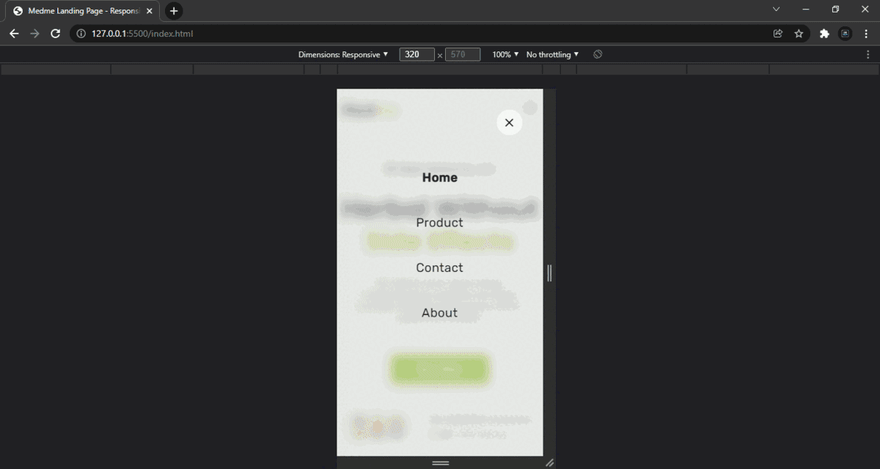
따라서 on click togleBtn 오른쪽 상단 모서리에 세 개의 막대가 있는 Navlink를 볼 수 있습니다. (토글 버튼을 생성할 때는 boxicons 라이브러리 또는 웹 사이트의 아이콘을 사용합니다.)
따라서 클릭 후 새로운 div가 열리며, 여기서 탐색 링크를 볼 수 있고, 오른쪽 상단 모서리에 있는 div를 닫기 위한 닫기 버튼을 볼 수 있습니다.
의학 반응 랜딩 페이지를 만들었던 이 글을 끝까지 읽어주셔서 감사합니다.
이제 랜딩 페이지를 더욱 흥미롭게 만들기 위해 GSAP Library를 사용하여 애니메이션을 추가해 보겠습니다.
그럼 Script.js 파일로 들어가보죠.
// ==== TOGGLE MENI ==== //
// ==== GSAP Animations ==== //
// ==== LOGO  ==== //
gsap.from(".logo", {
      opacity: 0,
      y: 10,
      delay: 1,
      duration: 0.5,
});
// ==== NAV-MENU ==== //
gsap.from("ul li", {
      opacity: 0,
      y: 10,
      delay: 1.4,
      duration: 0.5,
      stagger: 0.3,
});
// ==== TOGGLE BTN ==== //
gsap.from(".toggle_btn", {
      opacity: 0,
      y: 10,
      delay: 1.2,
      duration: 0.5,
});

// ==== FLEX ITEM ==== //
gsap.from(".flex-item-1", {
      opacity: 0,
      y: 20,
      delay: 2.8,
      duration: 1,
});

gsap.from(".customer-related-desc p", {
      opacity: 0,
      y: 20,
      delay: 2.8,
      duration: 0.8,
});

gsap.from(".rating-star i", {
      opacity: 0,
      y: 20,
      delay: 3,
      duration: 1,
});

gsap.from(".rating-count", {
      opacity: 0,
      y: 20,
      delay: 3,
      duration: 1,
});

gsap.from(".ratings", {
      opacity: 0,
      y: 20,
      delay: 3,
      duration: 1,
});

// ==== PLANT IMAGE ==== //
gsap.from(".plant-img img", {
      opacity: 0,
      y: 20,
      delay: 3,
      duration: 1,
});
감사합니다! 해피 코딩
'css' 카테고리의 다른 글
| 어두워짐(모드) (0) | 2022.01.19 |
|---|---|
| 테일윈드 CSS가 당신의 리뷰 과정을 개선할 수 있을까요? (0) | 2022.01.19 |
| 마이크로소프트 메이크코드 아케이드를 사용하여 짧은 게임을 만들었다. (0) | 2022.01.13 |
| 웹 사이트 확인을 위한 확장 크롬 (0) | 2022.01.13 |
| CSS의 세 가지 필수 요소 (1) | 2022.01.13 |


댓글