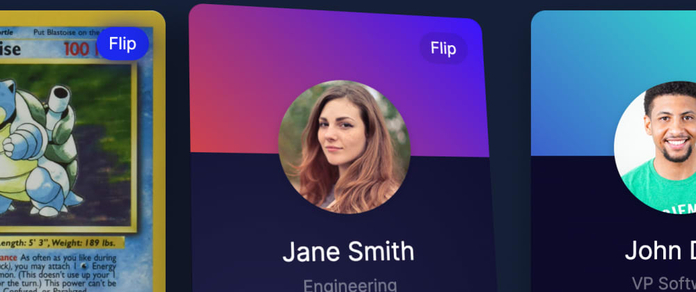
얼마 전에 3D 인터랙티브 CSS 버튼에 관한 기사를 썼어요. 유사한 기술을 사용하여 3D 인터랙티브(그리고 뒤집을 수 있는) CSS 사용자 카드를 디자인하기로 결정했습니다. 또한 은행 카드 UI, 플레이 카드 UI 또는 팀 페이지와 같은 다양한 작업에도 유용합니다. 데모는 아래에서 확인할 수 있습니다!
전체 코드는 항상 CodePen에서 사용할 수 있습니다.
CSS 및 Javascript를 사용한 3D 뒤집기 카드
아래 카드 위에 마우스를 올려놓거나 모바일에서 카드의 아무 곳이나 누르면 효과가 제대로 나타나는지 확인할 수 있습니다.
이러한 효과를 얻으려면 Javascript와 CSS에서 몇 가지 다른 사항을 결합해야 합니다.
- 먼저 마우스 위치에 따라 카드의 각도를 조작할 수 있는 기능을 만들어야 합니다.
- 다음으로 카드 위에
글레어빛 효과를 추가할 위치를 파악하기 위해 그 기능을 사용해야 합니다. - 그럼 CSS를 많이 추가해서 카드의 백페이스와 프런트 페이스가 만들어져야 합니다.
- 마지막으로, 우리는 카드를 뒤집을 수 있도록 자바스크립트에 몇 가지 기능을 추가해야 합니다.
HTML 작성
HTML부터 시작하죠. 첫 번째 카드는 이렇습니다 각 카드는 두 개의 주요 부분으로 구성되어 있습니다: 내부 카드와 내부 카드 백페이스. 첫 번째는 카드의 앞면을 포함하고 두 번째는 뒷면을 포함합니다.
또한 카드의 어느 면을 볼 수 있는지 변경할 수 있는 뒤집기 및 펴기 버튼도 있습니다.
    <div class="card blastoise">
              <span class="inner-card-backface"> <!-- back of the card -->
                            <span class="image">
                                              <span class="unflip">Unflip</span>
            </span>
        </span>
        <span class="inner-card"> <!-- front of the card -->
                      <span class="flip">Flip</span>
            <span class="glare"></span> <!-- to store the glare effect -->
        </span>
    </div>
JS 만들기
JS는 카드에 대한 사용자의 위치를 파악하여 CSS에 전달하는 각도로 변환하여 카드를 보는 방식을 바꾸는 기본적인 작업입니다. 그러기 위해서는 사용자가 카드의 중심에서 얼마나 떨어져 있는지 파악해야 합니다. 걱정해야 할 축은 두 개뿐이며, 아래 그림과 같이 사용자가 위쪽이나 아래쪽에 도달하면 카드를 중앙을 기준으로 회전시킬 수 있습니다.
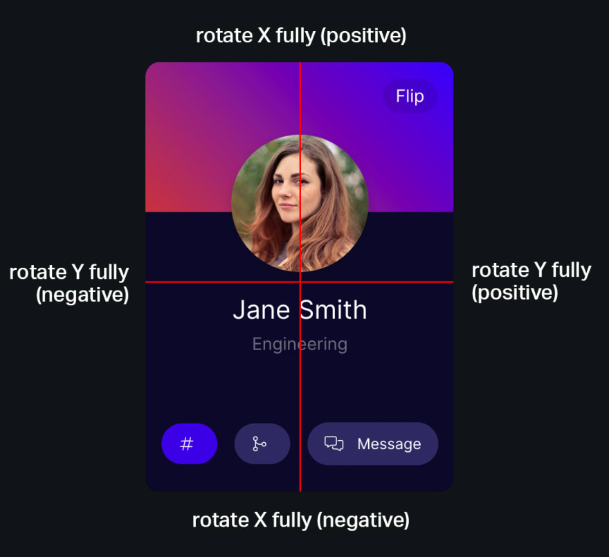
Javascript가 3D 뒤집을 수 있는 CSS 카드에서 작동하는 방법
궁극적으로, 우리는 카드 요소를 수용하고 그에 따라 CSS를 업데이트하는 함수를 작성한다.
let calculateAngle = function(e, item, parent) {
      let dropShadowColor = `rgba(0, 0, 0, 0.3)`
          if(parent.getAttribute('data-filter-color') !== null) {
                    dropShadowColor = parent.getAttribute('data-filter-color');
          }

      parent.classList.add('animated');
      // Get the x position of the users mouse, relative to the button itself
      let x = Math.abs(item.getBoundingClientRect().x - e.clientX);
      // Get the y position relative to the button
      let y = Math.abs(item.getBoundingClientRect().y - e.clientY);

      // Calculate half the width and height
      let halfWidth  = item.getBoundingClientRect().width / 2;
      let halfHeight = item.getBoundingClientRect().height / 2;

      // Use this to create an angle. I have divided by 6 and 4 respectively so the effect looks good.
      // Changing these numbers will change the depth of the effect.
      let calcAngleX = (x - halfWidth) / 6;
      let calcAngleY = (y - halfHeight) / 14;

      let gX = (1 - (x / (halfWidth * 2))) * 100;
      let gY = (1 - (y / (halfHeight * 2))) * 100;

      // Add the glare at the reflection of where the user's mouse is hovering
      item.querySelector('.glare').style.background = `radial-gradient(circle at ${gX}% ${gY}%, rgb(199 198 243), transparent)`;
      // And set its container's perspective.
      parent.style.perspective = `${halfWidth * 6}px`
          item.style.perspective = `${halfWidth * 6}px`

              // Set the items transform CSS property
              item.style.transform = `rotateY(${calcAngleX}deg) rotateX(${-calcAngleY}deg) scale(1.04)`;
      parent.querySelector('.inner-card-backface').style.transform = `rotateY(${calcAngleX}deg) rotateX(${-calcAngleY}deg) scale(1.04) translateZ(-4px)`;

      if(parent.getAttribute('data-custom-perspective') !== null) {
                parent.style.perspective = `${parent.getAttribute('data-custom-perspective')}`
      }

      // Reapply this to the shadow, with different dividers
      let calcShadowX = (x - halfWidth) / 3;
      let calcShadowY = (y - halfHeight) / 6;

      // Add a filter shadow - this is more performant to animate than a regular box shadow.
      item.style.filter = `drop-shadow(${-calcShadowX}px ${-calcShadowY}px 15px ${dropShadowColor})`;
}
이 함수는 4가지 작업을 수행합니다.
- 요소의 그림자가 3D 공간에서 이동하는 것처럼 보이도록 계산합니다.
- 마우스 위치에 따라 카드가 있어야 하는 각도를 계산합니다.
- 카드 앞면에 맞춰 백페이스의 위치를 계산합니다.
- 사용자의 마우스가 반사되어 나타나는 섬광의 위치를 계산합니다.
이제 우리가 해야 할 일은 각각의 마우스 움직임 이벤트에 이 기능을 추가한 다음 사용자의 마우스가 요소를 벗어날 때 모든 기능을 재설정하는 것입니다. 또한 카드를 뒤집기 및 뒤집기에 대한 몇 가지 기능도 추가될 것입니다.
document.querySelectorAll('.card').forEach(function(item) {
      // For flipping the card backwards and forwards
      if(item.querySelector('.flip') !== null) {
              item.querySelector('.flip').addEventListener('click', function() {
                        item.classList.add('flipped');
              });
      }

      // For 'unflipping' the card.
      if(item.querySelector('.unflip') !== null) {
              item.querySelector('.unflip').addEventListener('click', function() {
                        item.classList.remove('flipped');
              });
      }

      // For when the user's mouse 'enters' the card
      item.addEventListener('mouseenter', function(e) {
                calculateAngle(e, this.querySelector('.inner-card'), this);
      });

      // For when the users mouse moves on top of the card
      item.addEventListener('mousemove', function(e) {
                calculateAngle(e, this.querySelector('.inner-card'), this);
      });

      // For when the user's mouse leaves the card.
      item.addEventListener('mouseleave', function(e) {
                let dropShadowColor = `rgba(0, 0, 0, 0.3)`
                        if(item.getAttribute('data-filter-color') !== null) {
                                      dropShadowColor = item.getAttribute('data-filter-color')
                        }
                item.classList.remove('animated');
                item.querySelector('.inner-card').style.transform = `rotateY(0deg) rotateX(0deg) scale(1)`;
                item.querySelector('.inner-card-backface').style.transform = `rotateY(0deg) rotateX(0deg) scale(1.01) translateZ(-4px)`;
                item.querySelector('.inner-card').style.filter = `drop-shadow(0 10px 15px ${dropShadowColor})`;
      });
});
마우스 이벤트가 카드용 이벤트임을 알 수 있지만 변환은 주로 .inner-card에서 발생합니다. .card의 각도가 바뀌면 호버 박스가 바뀌기 때문이다. 그렇게 되면 사용자가 카드 위를 맴돌고 있을 수 있지만, 각도가 너무 바뀌어서 더 이상 그럴 수 없어 효과가 깨진 것처럼 보이게 된다. 카드에 호버 효과를 추가함으로써 고정 상자 내에서 .inner 카드를 변환할 수 있도록 하면서도 일정한 호버 상자를 유지합니다.
CSS 추가
마지막으로 우리는 CSS를 추가할 수 있습니다. 여기서 근본적인 것은 우리가 변환하는 카드인 .inner-card를 포함하는 카드 컨테이너 .card를 가지고 있다는 것입니다.
이러한 방식으로 작업을 수행하는 또 다른 이점은 사용자가 flip을 클릭할 때 부모 및 자식 요소를 유지하기 때문에 .card 자체를 뒤집을 수 있다는 것이다. 그것은 우리가 계속해서 .inner-card를 변형시킬 수 있고, 동시에 .card를 뒤집어서 더 매끄러운 효과를 낼 수 있다는 것을 의미한다.
.inner-card-backface에서는 rotateX(0) rotateY(0deg) scale(1) translateZ(-4px) 선 변환을 추가하여 4픽셀 뒤로 이동시킨다. 이를 통해 시원한 3D 깊이 효과를 낼 뿐만 아니라 사용자가 맴돌 때 앞면과 뒷면이 충돌하지 않도록 할 수 있다. 또한 백페이스 가시성을 .카드에 추가하여 등과 앞면이 상호작용할 수 있도록 합니다.
마지막으로, 우리는 .flipped 클래스를 사용하여 카드 전체를 뒤집기 때문에 카드 뒷면의 내용을 풀어야 합니다. 그렇게 하지 않으면 뒤에 있는 글자가 다시 앞으로 나타날 거예요! .flip-inner-card라는 클래스가 있습니다. 카드의 뒷면을 간단히 뒤집을 수 있습니다. 그래서 텍스트가 더 이상 앞으로 돌아가지 않습니다.
.card {
      box-shadow: none;
      backface-visibility: visible;
      background: transparent;
      font-family: Inter,-apple-system,BlinkMacSystemFont,Segoe UI,Roboto,Oxygen,Ubuntu,Cantarell,Open Sans,Helvetica Neue,sans-serif;
      transform-style: preserve-3d;
      padding: 0;
      height: auto;
      margin: 0 2rem 0 0;
      width: 18rem;
      height: 25rem;
      float: left;
      transition: all 0.2s ease-out;
      border: none;
      letter-spacing: 1px;
}
.flip, .unflip {
      background: rgba(0,0,0,0.1);
      font-size: 1rem;
      position: absolute;
      top: 1rem;
      right: 1rem;
      padding: 0.5rem 0.75rem;
      border-radius: 100px;
      line-height: 1rem;
      cursor: pointer;
      transition: all 0.1s ease-out;
}
.unflip {
      top: auto;
      background: #2d2d62;
      bottom: 1rem;
}
.flip:hover {
    background: rgba(0,0,0,0.3);
}
.card .flip-inner-card {
      transform: rotateY(180deg);
      position: absolute;
      top: 0;
      padding: 2rem 1.5rem;
      box-sizing: border-box;
      left: 0;
      width: 100%;
          height: 100%;
}
.inner-card-backface {
      transform: rotateX(0) rotateY(0deg) scale(1) translateZ(-4px);
      border-radius: 14px;
      background: linear-gradient(45deg, #0b0b2a, #0b0b2a);
      position: absolute;
      top: 0;
      color: white;
      padding: 2rem;
      box-sizing: border-box;
      transition: all 0.15s ease-out;
      will-change: transform, filter;
      left: 0;
      width: 100%;
          height: 100%;
}
.card.flipped {
      transform: rotateY(180deg);
}
.card .flip-inner-card {
      transform: rotateY(180deg);
      position: absolute;
      top: 0;
      padding: 2rem 1.5rem;
      box-sizing: border-box;
      left: 0;
      width: 100%;
          height: 100%;
}
결론
이 튜토리얼에서는 3D CSS 뒤집을 수 있는 카드를 만드는 방법을 다루었습니다. 사용자가 위를 맴돌면서 표시되는 각도를 파악하기 위해 필요한 기능과 이와 같은 3D 카드를 만드는 데 필요한 CSS에 대해 알아보았습니다. 개인 프로젝트 중 어느 것이든 즐겁게 사용하셨기를 바랍니다. 다음은 유용한 링크는 다음과 같습니다.
- 모든 코드는 코데펜에서 찾을 수 있습니다.
- 카드 대신 버튼이 있는 유사한 효과도 있습니다.
'css' 카테고리의 다른 글
| 62.5% 내가 가장 좋아하는 CSS 값(지금까지) (0) | 2022.02.16 |
|---|---|
| CSS 포지셔닝: 초보자의 CSS 포지셔닝 소개 (0) | 2022.02.16 |
| 초보 개발자를 위한 아이디어. (0) | 2022.02.15 |
| Flexbox 도움말 (0) | 2022.02.15 |
| JavaScript를 활용하여 디스플레이를 사용하는 CSS 전환 구현: 없음 (0) | 2022.02.15 |


댓글